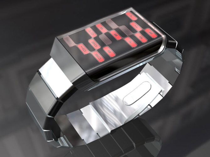
Like a metallic ribbon, the frame that weaves around the case is a single piece of metal in a sweeping single motion.
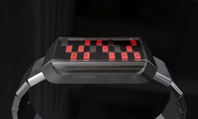
A retro calculator-like interface displays the time in three segments, hours at the top, groups of ten minutes at the bottom and single minutes in the center.
The smoked acrylic lens covering the case and bending across to make one side of the case gives a clean modern effect, the polished stainless steel case maintains the clean sleek appearance.


This watch has nice automotive approach to it. Theme seems to revolve around a retro luxury theme close to Lincoln’s identity. However, the sleek casing does not seem to compliment the wrist strap. The strap makes the casing look huge, while the casing makes the strap look bland and out of date. Tokyoflash designers! Your designs were great fun to look at, but try to focus on every aspect of the watch. Attention seems to be favored on either the casing or strap. Every bit must compliment the other in order to create a beautiful well rounded product.
Tracking time and Green lines were top in my opinion. The approach to ask consumers for opinions and criticism is a great method of improving the works of the designer, creating a consumer driven product, and producing a wonderfully unique business identity for an already colorful company. Thanks for the opportunity, and good luck paving a new road in the product industry!
LikeLike
ITS VERY NICE
LikeLike
Nice, but please get rid of the numbers.
An owner should know how to read it.
LikeLike
Very 70’s sci-fi. Perhaps marketing two versions? One with the numbers and one without? Not having the numbers would stop me from buying it.
LikeLike
I think the design is great even with the numbers. It looks like a watch you’d see on “Thunderbirds” (I know they were puppets).
LikeLike
It dose look good, but I don’t know why it’s not appealing to me.
LikeLike
I dont like anything about this one.
LikeLike
Can I ask if this display was in a completely different case would that you maybe more interested? The case is really different on this one for sure. Thanks for all your comments.
LikeLike
I think this is another highly original design and I would buy it. The way the case tapers is very attractive.
I would always suggest a day and date option as well.
I like the way the numbers are displayed. Perhaps using three different colours for each time aspect would be more interesting (?). I like the clustering used though – very original.
LikeLike
Case shape is nice but the display is not original…seems like an ordinary led watch.
LikeLike
I’m with Greenjalapeno, the strap doesn’t complement the case very well. The case seems fine now as it is, but the strap needs to follow the lines from the sides of the case. Other than that, the display and case seem fine!
LikeLike
I like the way that the glass wraps around the side of the case, but the whole design seems a bit too chunky for my taste. Also the strap is a bit too generic.
The way that the minutes are displayed is fine but I don’t like way that you have to add up the hours. It would be easier to read if each hour had its own indicator.
LikeLike
I like the look of the display on this, but the way you have to add up the hours is a bit awkward. I dont like the designs where you have to add the numbers 4+1=5.
LikeLike
I like the design of the watch, but i think that rather than have the 10 minutes at the bottom of the watch, it should follow the hours. I’m sure it’s just as easy to read having it the way you’ve got it, I think it’s just simplistic in that it should realistically follow the true time reading principal which is hours, 10 minutes, minute. But that’s just me. The overall look of the watch is clean and stylish in my opinion. It doesnt overstate itself which is a good thing because the face of the watch is very nice looking, and simple.
LikeLike