This striking concept watch design is deceptively simple to read; three windows on the face separate units of time.
Twelve digits in the top screen indicate hours, the bottom screen indicates five minute groups and the uniquely shaped screen to the left indicates four single minutes.
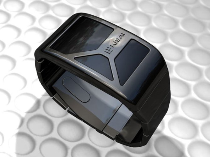
Orange LEDs diffuse light through the smoked mineral crystal lens to give a clear reading. The curved metal case with matching tapered wrist band create a bracelet style appearance.
未来の通信機器のようなデザイン。ケースからバンドまで曲線でつながる滑らかな形状に、形状の異なる3つのウィンドウを組み合わせた。3つのウィンドウはそれぞれ、時間、1分単位、5分単位を表示する。表示が消えた時のウィンドウは、何もなかったかのように、完全にブラックアウトされる仕様になっている。
Kisai Console is now available to buy here.
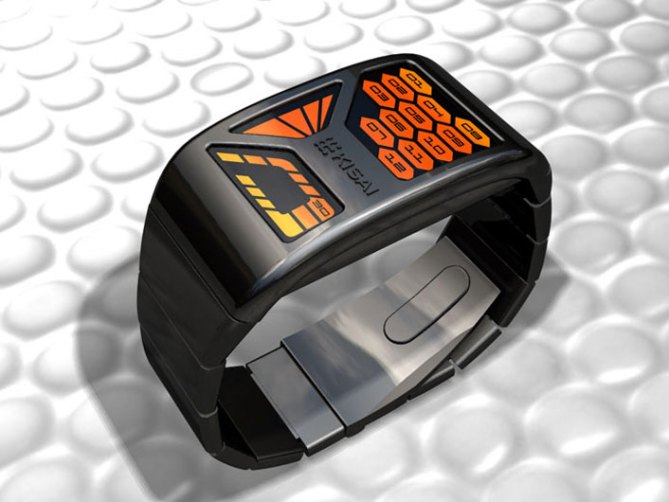
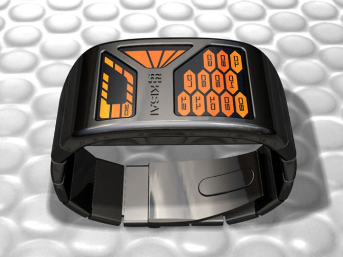
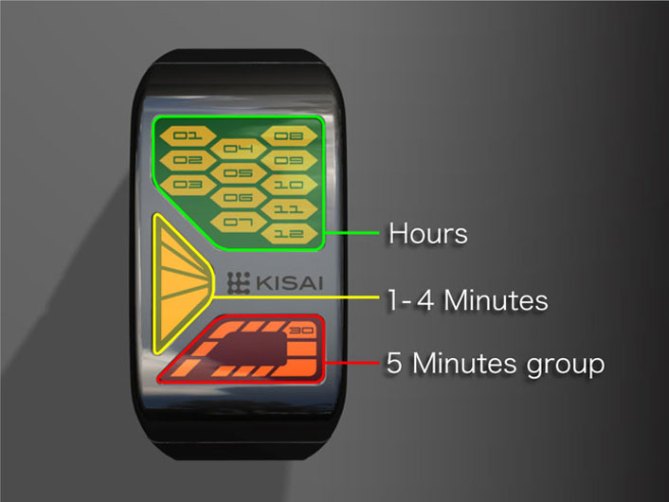


This watch has a very nice theme to it. It projects a sort of 90s futurist aura, perhaps even similar to an older star trek era.
LikeLike
I would like to see a variety of colour choices.
LikeLike
Very nice and clean design. Time segment nicely separated from each other for ease of telling time. The 5 minute segments would take a little getting use to for quick time reading. If the LED for each 15 minutes was made a different colour in this section I think it would be even easier to read.
LikeLike
Good feedback. Thank you!
LikeLike
I WOUD LIKE THIS WATCH, ITS TO EASE, QUICK TIME READING AND VERY NICE DESIGN
LikeLike
Yes! Yes! Yes! I would like this watch!! 🙂
LikeLike
I wish to buy this watch NOW! 🙂 I hope this design does go into production.
LikeLike
This is awesome, add another one or twp color options for it and it might be a winner.
LikeLike
This is a beautifully designed watch! I must echo the other entries in here, however, in that it needs more color variation. Maybe 3 separate colors, one for each time section. Or a dark orange/red fading from one section, making a full circle of color shading, ending with a white or extremely lighter orange color in the last section of the last time area
LikeLike
This watch is amazing, and I actually prefer the one colour LED. Looks as beautiful with the LEDs off as with them on…
LikeLike
would like to own it
LikeLike
I was talking about the possibility of ordering it in other colors, not just in orange. :p
Anyway, it’s nice to see that red/yellow/green combo gone. Try some other ones for the watch line-up, like red/white/blue, red/yellow/blue, red/white, blue/white, cyan/blue/green etc.
LikeLike
I’d like for minutes to be in tens, and single minutes up to 5 with a +5 light. Also, more color choices (though I do really like this orange, very Star Trek: Next Gen)
LikeLike
One of the reasons I stopped buying watches on here recently is that its hard to tell time on most of them. This one is a bit easier to tell time. I think that you should rethinking the 10 minutes area to make it easier. If you reposition the numbers so that they are more in step with a real clock (0 being at top, 30 at bottom, etc) it would make it easier. I like the look of the shell of the watch. I think it should be made out of gun metal titanium, to make it light weight and sleek. I think the 3 section LED’s should be 3 different colors. Even better, it would be nice to have all the numbers light up when you check the time but have the actual time a different color-meaning that if it is 3pm, have all the lights come on but have 3 a different color that stands out. I definately like the bracelet look and the flat top to make it sleek and not stick out from your wrist very far.
LikeLike
Thank you for your reply, and noted about our watches being too hard to read. We are addressing these issues now and even going a few steps further by asking our customers directly what they like. All your comments are taken seriously and want to make the watch of your dreams! The goal is to make the time telling process very easy while looking very different. Something anyone could wear. Art on your wrist. Also keep checking the blog as we are branching off into other products now.
LikeLike
this is nice. makes it easy to read the hours. from there, the actual minute time isn’t as important. as long as i’m within 5 minutes of actual time, that’s all that matters.
What i would REALLY like to see in your watches is an accelerometer function. Instead of having to push a button, as soon as you rotate your wrist to view the watch, the screen comes on. i have 4 of your watchs and i really like the Fusion DT1 and Titan. but it is a bit of a pain to push that button.
Also, if you could keep the thickness to no more than 8 mm (5 mm would be preffered, at least for me. i like thin watch faces like my Skagen(r) designs).
LikeLike
I am very fond of the TokyoFlash concept, and very much the Kisai designs. I do not, however, like the name of the brand as a part of the design. I recently bought a Kisai Tenmetsu, that would lose a great deal of its clean beauty and timeless mystic with a logotype printed on it.
LikeLike
I agree about keeping all designs clean. We have not put any logos on the KISAI brand for that reason. If it was printed on the side would it be OK?
LikeLike
Even though I think Kisai deserves to be acknowledged, I would prefer all watches to be free from text, to keep the “out-of-this-world” feeling, that makes them so special. Best is when it’s just an enjoyment of material and shape.
Keep the information on the backside. When someone gets interested, they will ask, for sure.
LikeLike
I like the overall design of this watch, as well as the tone and neutrality of the case combined with the orange led (could work well in other colours but not more than one colour leds per watch)
In relation to the logo, that could always be moved to one of the sides couldn’t it.
In relation to difficulty of reading time, I think there is definately a market for people who want an unusual method to display time.( the only person who needs to be able to read the watch is the wearer not the person asking the wearer for the time).
My main issue for not buying a watch even if I like the design would be actual size of the watch on my wrist.
So for me if this design stayed as it is it would have to be smiliar in size lengthwise to the “retsu” watches and not as big as the pimpin watches.Myfavourite form factor from my purchases at Tokyoflash has been that of the Twelve-5-9 B, which is the longest length of the watch face running in line with the arm rather than at 90 degrees to it.This is watch would look amazing if the it followed that adaption then I would definately buy it or 2 if available in other colour leds.
LikeLike
I love it.
Very nice design, very nice color.
I want it
LikeLike
Nice use of shapes on the watch face, the top hours section reminds me of “Blockbusters” a tv programme from the early 1980’s… genius!!
LikeLike
Yes I think this design reminds people of various things which draws peoples attention.
LikeLike
Love it! I would not change a thing. I love the one color led. The watch itself reminds me of the 80’s show “Night Rider”. I would definatley buy this one!
LikeLike
I love this Design it is simplistic and funtional and its darn Kool !!
I would love to see a watch that measures biometrics, pulse etc,bar graph etc
LikeLike
Nice idea, thank you for the feedback!
LikeLike
I am -so- in love with this one, I mean… Wow! There’s a reason to call it -striking- concept, I guess, because it definitly looks like it’s out of this world… Even though it’s not. I just thought of something, though. Having seen those images, I wondered how that watch would be activated, if there’s not a button to press, or something?
LikeLike
This watch look really great. However, I would prefer it if you could make more LCD based watches like the rogue.
This one would work as an LCD design I think. You could just have a reflective orange [or some other colour for those here who don’t like the orange] background and then have the LCD go out to reveal the hole instead of lighting up.
The problem with LED is that they eat batteries and I don’t like having to press a button on the watch every time I want to see the time.
Also just a note to your designers, I’d love to have a standard binary LCD watch too – there are loads of LED ones around but I can’t find an LCD one at all.
LikeLike
I LOVE this design, it has a beautiful clean look. The time is much easier to read on this one and the smoked lens is a great look. The only thing I would add is a choice of colors, orange is not my favorite, Green or Blue would look great. The case finish I like, but would prefer something in a brushed metal with a choice of gunmetal or unfinished silver(I still would buy it as is) Also, like the logo where it is at, I would not put it on the side as stated earlier, that space needs something minimal there without taking away from the overall look, the logo is perfect where it is at.
Please let me know if and when this design is avaliable, put me down for one in blue 🙂
LikeLike
Correction…put me down for one in each color!
LikeLike
This is my overall favourite so far. The method of telling the time is perfect – easy, looks cool, reminds me of a sci-fi control panel. The case & strap are nice.
The ultimate watch would be combining this display (or variation of it) with this case http://www.tokyoflash.com/blog/?p=622
It would be like nothing seen before!
LikeLike